Summary
This
animation is comedy short about that is inspired by the "Here's
Johnny" scene from The Shinning, it is a horror film and in
the "Here’s Johnny" scene, the palette of the scene has dull nude
colours which makes it very ominous and chilling.
Sequence
My
animation is a comedy genre short about an average guy named Johnny who tries his hardest do be positive, the scene is set in the ordinary world.
The
sequence starts with Johnny walking home from a long day at work, because he is
so tired he doesn't notice that he is crashing and destroying everything he
walks into. It isn’t until he reaches his home that he realizes he can finally
relax and see his wife. But he hasn’t exactly snapped out of his trance because
he smashes his face through the front door and lovingly calls out to his wife “Here’s
Johnny!”
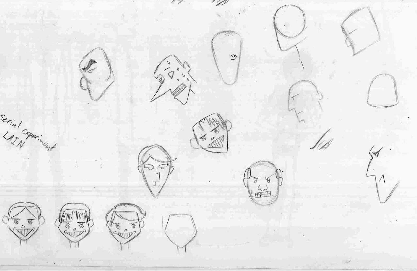
Character
profile
Johnny
is an ordinary guy, he has a loving wife and a nice home. Johnny’s wife Suzie is
a proud self-employed baker and runs her own little cake shop in their small
town that she absolutely loves. However, Johnny works at an insurance company,
and finds being cramped in a small cubicle while sorting through a bunch of
paper work extremely boring but tries to stay positive for his wife’s sake. Sometimes
Johnny tries too hard to keep his boss and coworkers happy which leaves him very
drained on the inside but at the end of the day he is just glad to be home with
his loving wife.